|
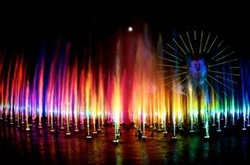
Hi! Back again! I pondered for a bit this week on what I wanted to share. I recently experienced the new Disney spectacular “The World of Color” and it got me to thinking… you know what? Let’s talk a little about color.
“Ahhhhhhh!!!!” you say?
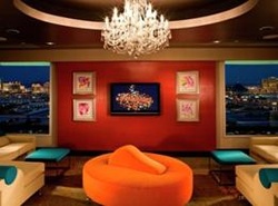
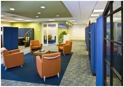
Scary word for some when it comes to things like clothing and even more so, interior spaces! It’s funny to us that over so many years of practicing design just how intimidated people and clients are about the use of color! Come on now, be brave! Color is naturally present in everything around us. So, why not more color in what we choose to wear and even more so, the spaces that we inhabit, both in our private and public spaces? Color has a mysterious and magical quality that has the ability to make us react and feel. We see it in symbolism, like the Royalty of Purple and the Passion of Red. We have all subconsciously reacted to and experienced color, whether we are aware of it or not. Color changes and dances; color interacts with light to create different affects. In the same setting, colors will appear different, just from differences in the time of day or type of lighting. It’s really a very fascinating thing! Color can reflect and also absorb, creating different feelings in the same spaces. Imagine you're driving by a green field of grass, punctuated by yellow wild flowers. You’ll notice the yellow flowers more than the green grass, because yellow is the first color our eyes notice. Painting walls a pale yellow mimics a sun-filled space and creates a soothing feeling for the room's occupants. White lace or sheer curtains, tinted with a tiny amount of pale yellow dye, will make a home feel sunny and cheerful. However, bright yellows can cause feelings of turmoil and hostility. Therefore, bright yellows should be used sparingly, especially in high-anxiety centers such as kitchens. Also, naturally bright rooms that have been painted bright yellow may over-stimulate some people, contributing to angry feelings. However, that very same dazzling yellow room may be just the perfect place on an overcast day in a cold climate. Red is the strongest and longest-lasting color our eyes process. Red is like a cup of tea or coffee; it awakens the senses. Dining room walls painted dark rouge red are not only romantic and festive; but they also help make food taste fabulous. At night, in low light, dark red is lavish and sensuous. In the morning, the same red enlivens and motivates you to live the day fully. Many people are afraid to use red on walls because they mistakenly believe red to be an angry or blood-associated color, but red is auspicious, not caustic. Artwork often looks more important with a red background as opposed to white, and almost everyone looks great with rich red as a background color. Light sky blue has a soothing effect on humans. This is because the pituitary gland releases tranquilizing hormones when we look at sky blue. If you want the feelings generated by baby blue but reject the color as "babyish," add a little black and use a complex grayed-blue. White suggests cleanliness and reflects the most light. It's the purest of all the colors and psychologically denotes respectability and attention to hygiene. Brilliant white adds coolness to hot color schemes. Too much white will cause squinting and eyestrain, however, and it's uncomplimentary to pale-skinned people. Gray makes rooms seem refined and exclusive and denotes prudence and humility, while bringing an aura of elegance. The only color that leaves no after image, gray instills creativity, imagination, and meditation, but should be avoided in areas where the natural daylight is often diffused by overcast skies. Color affects human beings on a variety of levels, including changes in our very body chemistry. Therefore, a considerable amount of thought should be given to the color scheme of a room, depending on its use and the effect you're trying to achieve. It’s interesting that all color begins with the three core colors in their purest form: Red, Blue and Yellow. The millions of colors are all derived from this trinity. And these three in the purest form cannot be broken any further! It is fascinating when you think about it! One of the great joys that we experience as interior designers is when a client is brave and open to working with color. It’s just color and can be dialed up and down very easily when you create a palette! Hopefully this will allay some reservations that you may have and allow you to be more receptive and adventurous the next time you redesign a space or select a new outfit! -Larry Colorful based interior spaces:
Links related to this entry:
The Stardust Suite @ The Orleans Hotel & Casino Disney's World of Color
3 Comments
7/24/2012 05:34:55 pm
Nice post! Everything I desired summarized in a very short way. In my opinion it’s the most amazing work I have never read.
Reply
Leave a Reply. |
SubscribeEnter your email below to be notified when we post a new blog!
AuthorWHL Design Group is a full service Commercial Interior Design firm in Las Vegas, NV specializing in Hospitality, Retail, Corporate, Office, HOA & Multifamily design. Archives
March 2024
Categories
All
|
|
PLANNING · INTERIOR DESIGN · PROJECT COORDINATION · PROCUREMENT
FOLLOW US
|
Copyright © WHL Design Group, PC
Site Map
Site Map


 RSS Feed
