|
Well, hello again everyone! You know, nothing is as easy to change the look of a space or room than 30 dollars and a free afternoon. Okay and a little skill perhaps. I have always said simply taking the time to paint a room or accent wall with a fresh coat of paint (in a wonderful color, of course) is the easiest and quickest way to make that change and breathe new life into an interior! Stop Worrying!  It’s not really that big of a deal and you will be glad you did it. Nothing makes a space feel clean and fresh like a new coat of paint. Okay, so do you struggle with selecting a paint color and type? Hmmm… What to do… I know! Try ….whldesign.com! I hear they have an awesome “virtual designer” site that can take the sting out of these selections. But here are a couple of tips anyway. First off, know the surfaces that you are painting and the conditions that they are in and do the necessary preparation work required to receive the paint. If you are not sure, you can use the “Ask the Designer” feature at whldesign.com that is totally free! Never turn down a good free opportunity! Next, make some paint selections and if the store has small samples, get them! The colors will look SO different in your house based on your lighting type and how much daylight you get. Everything will look different in the evening too! So paint a small area and look at it for at least 24 hours in the morning, mid-day, and evening - with lights and television on too!  The only time this is not necessary is if you have had warehouse lighting purposely installed in your house. You know, like Lowes? If this is the case, forget the paint! You have bigger issues to deal with! 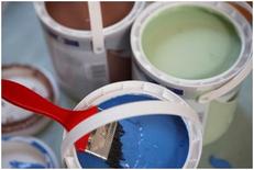 Some paints require primers or first coats to make sure that the color reads correctly. This is mostly true of deeper saturated colors. It is also true when you are painting a darker wall lighter or a lighter wall darker! Well Here Is Your Cheat Sheet! PRIMERS / SEALERS: These coatings are designed to provide a surface for the finish coats of paint or clear finishes. Primers seal the surface off and provide a "tooth" for the finish paint; they are used on bare wood and metal, previously painted surfaces that have been repaired or are in poor condition (flaking or peeling), or if the existing surface is to be painted with a new color that is much darker or lighter than the existing color. Primers/Sealers are also used to block out stains like water stains, crayon, smoke, soot, ink, and on woods that will bleed through a paint coating, i.e. cedar or redwood. Primers/Sealers insure a longer lasting paint finish, as the resins in the finish paints stay on the surface, creating the "wear layer" as they are designed to do. Peeling and premature failure is eliminated and this is by far the most important part in getting a long lasting, durable finish. FINISH PAINTS: There are two types of paints used today, latex and alkyd. Alkyd paint is also known as oil-based paint. Latex provides an excellent finish, while being an easier paint to use. Latex paint cleans up with soap and water, dries quickly, has less odor, is non-flammable, easy to touchup, and remains more flexible and allows moisture to evaporate through the film, thus reducing blistering, cracking and peeling. Inexpensive latex paints use softer vinyl resins (binders) and more water in the formulation, while the more durable of the latex paints use 100% acrylic resins and less water (you only get what you pay for). The term "Enamel" is normally associated with paints that have some gloss to the finish. Enamels are formulated with higher concentrations of resin, as they are intended to be subjected to more wear and tear. LEVELS OF GLOSS: The sheen of paint is the amount of light reflected by the surface of the paint finish. There are four basic sheens: flat, satin, semi-gloss and gloss. Flat Paints: These paints exhibit non-reflective properties, providing a matte finish. This finish helps hide surface imperfections, and is normally used for ceilings, and walls in areas not subjected to a lot of wear and tear, like dining rooms, living rooms and bedrooms not used by small children. Satin Paints: Also know as eggshell finish, satin paints provide a soft luster sheen similar to that of an eggshell. A satin finish provides a harder surface finish, which is more durable and more stain resistant than a flat finish. This durability makes satin finish paint a good choice for walls in children's rooms, hallways, stairways and family rooms. Semi-gloss Paints: These paints are very durable; they are easier to clean and are more stain resistant than satin finish paints. Semi-gloss paints are most often used on heavy wear surfaces or in areas that are frequently cleaned, such as kitchens and bathrooms. Semi-gloss paint is also used on wood trim and cabinets. Gloss Paint: This is a harder, more durable, more stain resistant paint finish. It is easier to clean than all the other paint finishes. Gloss finishes generally make surface imperfections more noticeable. Gloss finishes are the best choice for heavy wear areas like kitchens, bathrooms, furniture and cabinets, floors, stairs, handrails, high traffic doors and trims. Which type of paint should you use? Two properties you need to consider: how much wear and tear will the surface get and is a sheen or gloss to the finish going to conflict with your decorating scheme. If you are painting a storage room or other area which will be subjected to hard use and frequent washings, go with the highest gloss, as these paints are designed for just that. If the "feel" of the room is important, such as a living room or bedroom, choose the lower gloss finishes for a calm, soothing feeling. Going Green! Okay these might be a little “Sciency”, but they are easier on the environment! Types of Non-Toxic Paints and Finishes: The term "non-toxic" is used here in its broadest sense. With paints and finishes, it's more a matter of degree. Even Zero VOC (Volatile Organic Compounds) formulations contain some small amounts of toxins. There are three general categories of non-toxic (or low-toxic) paints: Natural Paints, Zero VOC, and Low VOC. Natural Paints and Finishes: These are paints made from natural raw ingredients such as water, plant oils and resins, plant dyes and essential oils; natural minerals such as clay, chalk and talcum; milk casein, natural latex, bees' wax, earth and mineral dyes. Water-based natural paints give off almost no smell. The oil-based natural paints usually have a pleasant fragrance of citrus or essential oils. Allergies and sensitivities to these paint types are uncommon. These paints are the safest for your health and for the environment. Zero VOC: Any paint with VOCs in the range of 5 grams per liter or less can be called "Zero VOC", according to the EPA Reference Test Method 24. Some manufacturers may claim "Zero VOCs", but these paints may still use colorants, biocides and fungicides with some VOCs. Adding a color tint usually brings the VOC level up to 10 grams per liter, which is still quite low. Low VOC: Low VOC paints, stains and varnishes use water as a carrier instead of petroleum-based solvents. As such, the levels of harmful emissions are lower than solvent-borne surface coatings. These certified coatings also contain no, or very low levels, of heavy metals and formaldehyde. The amount of VOCs varies among different "low-VOC" products, and is listed on the paint can or MSDS (Material Safety Data Sheets). Paints and stains, to meet EPA standards, must not contain VOCs in excess of 200 grams per liter. Varnishes must not contain VOCs in excess of 300 grams per liter. As a general rule, low VOC paints marketed by reputable paint manufacturers usually meet the 50 grams per liter VOC threshold. Paints with the Green SealStandard (GS-11) mark are certified lower than 50 grams per liter (for flat sheen) or 150 grams per liter (for non-flat sheen). Low VOC paints will still emit an odor until dry. If you are particularly sensitive, make sure the paint you buy contains fewer than 25 grams per liter of VOCs. Okay now…  Wake Up!  And Start Painting! -Larry
2 Comments
Hi! Back again! I pondered for a bit this week on what I wanted to share. I recently experienced the new Disney spectacular “The World of Color” and it got me to thinking… you know what? Let’s talk a little about color.
“Ahhhhhhh!!!!” you say?
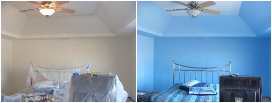
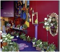
Scary word for some when it comes to things like clothing and even more so, interior spaces! It’s funny to us that over so many years of practicing design just how intimidated people and clients are about the use of color! Come on now, be brave! Color is naturally present in everything around us. So, why not more color in what we choose to wear and even more so, the spaces that we inhabit, both in our private and public spaces? Color has a mysterious and magical quality that has the ability to make us react and feel. We see it in symbolism, like the Royalty of Purple and the Passion of Red. We have all subconsciously reacted to and experienced color, whether we are aware of it or not. Color changes and dances; color interacts with light to create different affects. In the same setting, colors will appear different, just from differences in the time of day or type of lighting. It’s really a very fascinating thing! Color can reflect and also absorb, creating different feelings in the same spaces. Imagine you're driving by a green field of grass, punctuated by yellow wild flowers. You’ll notice the yellow flowers more than the green grass, because yellow is the first color our eyes notice. Painting walls a pale yellow mimics a sun-filled space and creates a soothing feeling for the room's occupants. White lace or sheer curtains, tinted with a tiny amount of pale yellow dye, will make a home feel sunny and cheerful. However, bright yellows can cause feelings of turmoil and hostility. Therefore, bright yellows should be used sparingly, especially in high-anxiety centers such as kitchens. Also, naturally bright rooms that have been painted bright yellow may over-stimulate some people, contributing to angry feelings. However, that very same dazzling yellow room may be just the perfect place on an overcast day in a cold climate. Red is the strongest and longest-lasting color our eyes process. Red is like a cup of tea or coffee; it awakens the senses. Dining room walls painted dark rouge red are not only romantic and festive; but they also help make food taste fabulous. At night, in low light, dark red is lavish and sensuous. In the morning, the same red enlivens and motivates you to live the day fully. Many people are afraid to use red on walls because they mistakenly believe red to be an angry or blood-associated color, but red is auspicious, not caustic. Artwork often looks more important with a red background as opposed to white, and almost everyone looks great with rich red as a background color. Light sky blue has a soothing effect on humans. This is because the pituitary gland releases tranquilizing hormones when we look at sky blue. If you want the feelings generated by baby blue but reject the color as "babyish," add a little black and use a complex grayed-blue. White suggests cleanliness and reflects the most light. It's the purest of all the colors and psychologically denotes respectability and attention to hygiene. Brilliant white adds coolness to hot color schemes. Too much white will cause squinting and eyestrain, however, and it's uncomplimentary to pale-skinned people. Gray makes rooms seem refined and exclusive and denotes prudence and humility, while bringing an aura of elegance. The only color that leaves no after image, gray instills creativity, imagination, and meditation, but should be avoided in areas where the natural daylight is often diffused by overcast skies. Color affects human beings on a variety of levels, including changes in our very body chemistry. Therefore, a considerable amount of thought should be given to the color scheme of a room, depending on its use and the effect you're trying to achieve. It’s interesting that all color begins with the three core colors in their purest form: Red, Blue and Yellow. The millions of colors are all derived from this trinity. And these three in the purest form cannot be broken any further! It is fascinating when you think about it! One of the great joys that we experience as interior designers is when a client is brave and open to working with color. It’s just color and can be dialed up and down very easily when you create a palette! Hopefully this will allay some reservations that you may have and allow you to be more receptive and adventurous the next time you redesign a space or select a new outfit! -Larry Colorful based interior spaces:
Links related to this entry:
The Stardust Suite @ The Orleans Hotel & Casino Disney's World of Color |
SubscribeEnter your email below to be notified when we post a new blog!
AuthorWHL Design Group is a full service Commercial Interior Design firm in Las Vegas, NV specializing in Hospitality, Retail, Corporate, Office, HOA & Multifamily design. Archives
March 2024
Categories
All
|
|
PLANNING · INTERIOR DESIGN · PROJECT COORDINATION · PROCUREMENT
FOLLOW US
|
Copyright © WHL Design Group, PC
Site Map
Site Map







 RSS Feed
