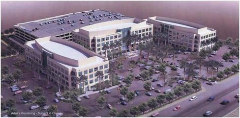
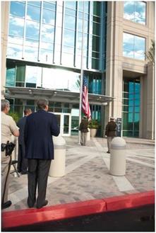
 Artist’s rendering of the proposed project (2008) Artist’s rendering of the proposed project (2008) Yesterday we attended the Las Vegas Metropolitan Police Headquarters Grand Opening Ceremony! We are proud to be the interior design firm selected to provide the tenant improvements to the developer’s core and shell building. The public only gets the condensed media version of the project, but this project started for us in 2007, as we began the feasibility studies to determine if this project could even be built and what it would take to accomplish it. We met with several LVMPD bureaus to evaluate many factors; employee counts, space requirements, operating problems, transportation and travel costs, leasing information, equipment requirements, department interactions, etc., etc. This information was then developed into a hypothetical space plan to determine the required size of the new campus. Several more meetings were held between public officials, Metro and the developer to get this project approved and underway. The official Ground Breaking was held on October 23, 2009, and things really got moving. The next official milestone was the Topping Off Ceremony, held on July 15, 2010. After that, our job became extremely busy, as we coordinated the tenant improvement build out of all the interior office spaces in all three buildings. On the first day of moving people into the completed project, there was a small Flag Raising Ceremony. 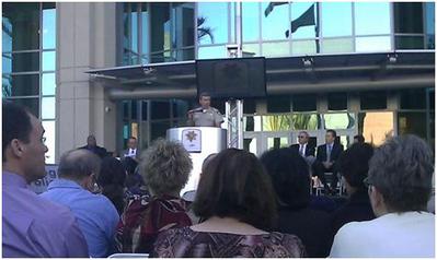 Sheriff Douglas C. Gillespie speaking at yesterday’s ceremony Sheriff Douglas C. Gillespie speaking at yesterday’s ceremony And the culmination of all our efforts was recognized yesterday, October 26, 2011, at the Grand Opening Ceremony. Here are a few more pictures of the completed project: We sincerely enjoyed working on this project, as everyone on this project team was a pleasure to work with. We wish the Las Vegas Metropolitan Police Department the best as they continue to protect and serve the community, all from their new home!
-Carol Links Related To This Post: Las Vegas Metropolitan Police Department: http://www.lvmpd.com/
1 Comment
 No…Not that kind of stoned! This kind of Stoned! Ever really wonder what the differences are and the best uses? Well we hear all the time in the real estate world and again on that HGTV about granite countertops, as if Granite is all that is available! (By the way, most granite counters less than 10 years old use resin to fill natural gaps in the stone, and they can’t take the heat from hot pots, which is why a lot of people want the granite in the first place!) There are so many other choices out there, and if specified and used in the right application, they can live a lifetime or two if cared for properly. Stone is a natural material and can be so beautiful if maintained correctly! Being that it is a natural material, it requires different care than simply swiffering or windexing like we would see in synthetic products.
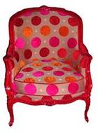
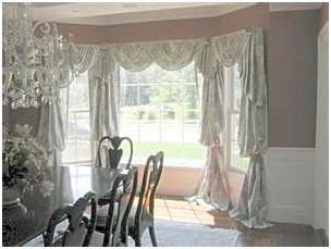
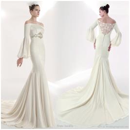
Here is a wonderful link to tell you all about the different types of stones, the best uses, how the good earth formed them, and the best way to maintain them! Next time you are thinking about renovations or design … think twice about that laminate or ceramic… go on… be brave! Get STONED! http://www.stonecaretechniques.com/10_m.htm BergèreDo you..... Well, we can guess that it is a French word … it is really a specific type of closed arm chair! There are all sorts of terms and descriptions in the Interior Design world. All styles have deep roots to parts of the world throughout time, from European Renaissance to Asian Dynasty to Egyptian Empirical Eras. Here is another… A Bishop's Sleeve… Should sound simple – is it really part of a religious garment? Well maybe if he is a Designer - but no, it refers to a drapery panel style seen here: There is also cross over into the world of Fashion and Couture with Interior Design. As you can see, this is also a bishops sleeve design detail in this Gown: If you really want to know more, check out the new section on our website: Interior Design Terms and Glossary! You can see it here: http://www.whldesign.com/glossary.html
Let me ask you… should artwork “match or coordinate” with an interior space? Well perhaps if you just want it to blend into the background. The interesting thing about art is that it is supposed to be noticed and have emotion and identity and promote thought and inquisitiveness. If you allow artwork to blend into a design, it’s lost. Art, especially very lovely unique fine art, should be enhanced and noticed. Some are not bold enough to do this, but it is not the point to use it as an accessory or filler in interior design. Art should also have love, meaning and significance to the owner. Art is to remind us of something special… a time… a person… a memory. Whatever it is, it is unique to all. Art should make you stop and take note. If you have ever stopped and looked at artwork and stated, “ugh, that is awful or hideous or wonderful” then you have been engaged. It caused you to render emotion, comment or reaction. Now, if you just walked past a piece that was so blended, it would be lost. There is no rhyme or reason either. Contemporary and abstract can be displayed beautifully in a traditional space and vice versa. Look at these examples and think about the placements either for your art or others as you go forward!!  Let’s talk space planning or floor planning. Are you a wall flower? I am referring to arranging your furnishings around the perimeter of the walls. Get off the wall! You know that is not really space planning. You need to try to be more creative with furniture placement by floating furniture and perhaps creating groupings. This works for all sorts of spaces and rooms. You know it really is just furniture and accessories. Think of mixing it up a bit. People are creatures of habit. You will be amazed at what a simple rearrangement can do. You create completely different environments and feelings in a space. You create new circulation and traffic patterns too. By simply rearranging your floor plan you help in even wear of furnishings, especially flooring and carpeting. Nothing creates a fresher environment and impact with zero investment than a simple rearrangement. Look at these before and after ideas and give it a shot! Before...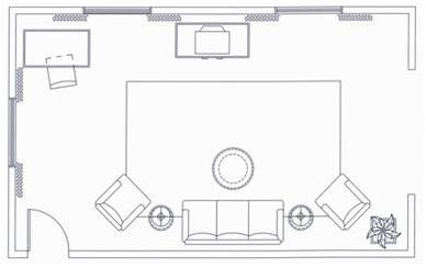 The space is defining you. Circulation is right through the center of the space. Room looks sparse even with more furniture. After...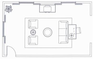 You defined the room. Circulation is directed and guided around the perimeter of the space. Focus is on the windows and the seating is more functionally engaging for interaction and television. Space looks full and much more spacious than it is. It is an illusion. We were even able to eliminate a table. Desk area is engaged, while still having its own identity and the approaches into the space are more visual! Get off the wall! Floating furnishings works for any space even, in commercial spaces like offices and retail. It is much more engaging and interactive for the users!! Here are some other examples!! |
SubscribeEnter your email below to be notified when we post a new blog!
AuthorWHL Design Group is a full service Commercial Interior Design firm in Las Vegas, NV specializing in Hospitality, Retail, Corporate, Office, HOA & Multifamily design. Archives
March 2024
Categories
All
|
|
PLANNING · INTERIOR DESIGN · PROJECT COORDINATION · PROCUREMENT
FOLLOW US
|
Copyright © WHL Design Group, PC
Site Map
Site Map




 RSS Feed
